&rew Graphic Design
DESCRIPTION
In this project, I explored the unique challenge of building a brand identity for my personal branding suite. As someone with colorblindness, I wanted the brand to reflect my perspective while still showcasing my passion for vibrant colors. This resulted in a fascinating design process where I investigated how to represent myself visually, both embracing my color vision and incorporating the bold color palettes I gravitate towards. The project required the creation of a logo, comprehensive stationery suite, and additional brand elements. I’m excited to share the final outcome and the thought process behind it.
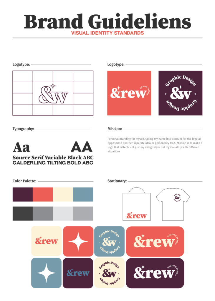
BRAND GUIDELINE
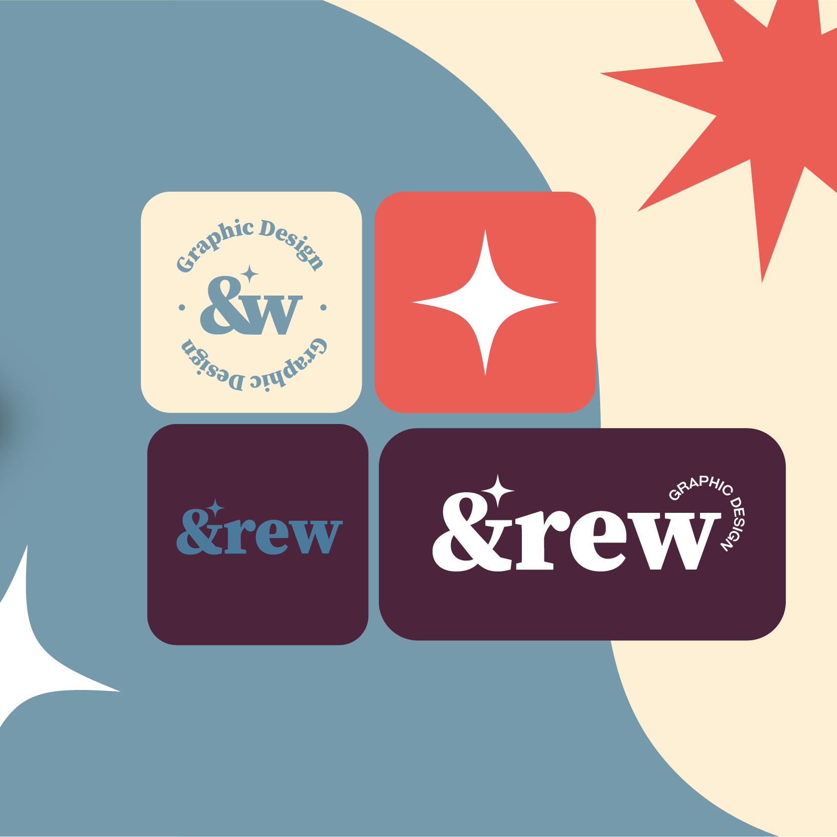
This document outlines the core visual elements that define my personal brand. My color palette features a light blue, evoking trust and clarity, alongside a light red that injects energy and playfulness. A dark purple adds depth and intrigue. Two fonts are utilized: a monospace sans-serif font that is used for subheddings and paragraph’s, and a more playful, serif font for subheadings and creative content. The logo comes in two forms: a primary version that combines the brand name with a unique logo mark, and a secondary mark ideal for smaller applications. Additionally, a geometric pattern incorporating the brand colors with different hue shifts can be used for backgrounds or accents. While variations are encouraged, I always try to maintain overall brand consistency.
CARD (HOVER OVER)
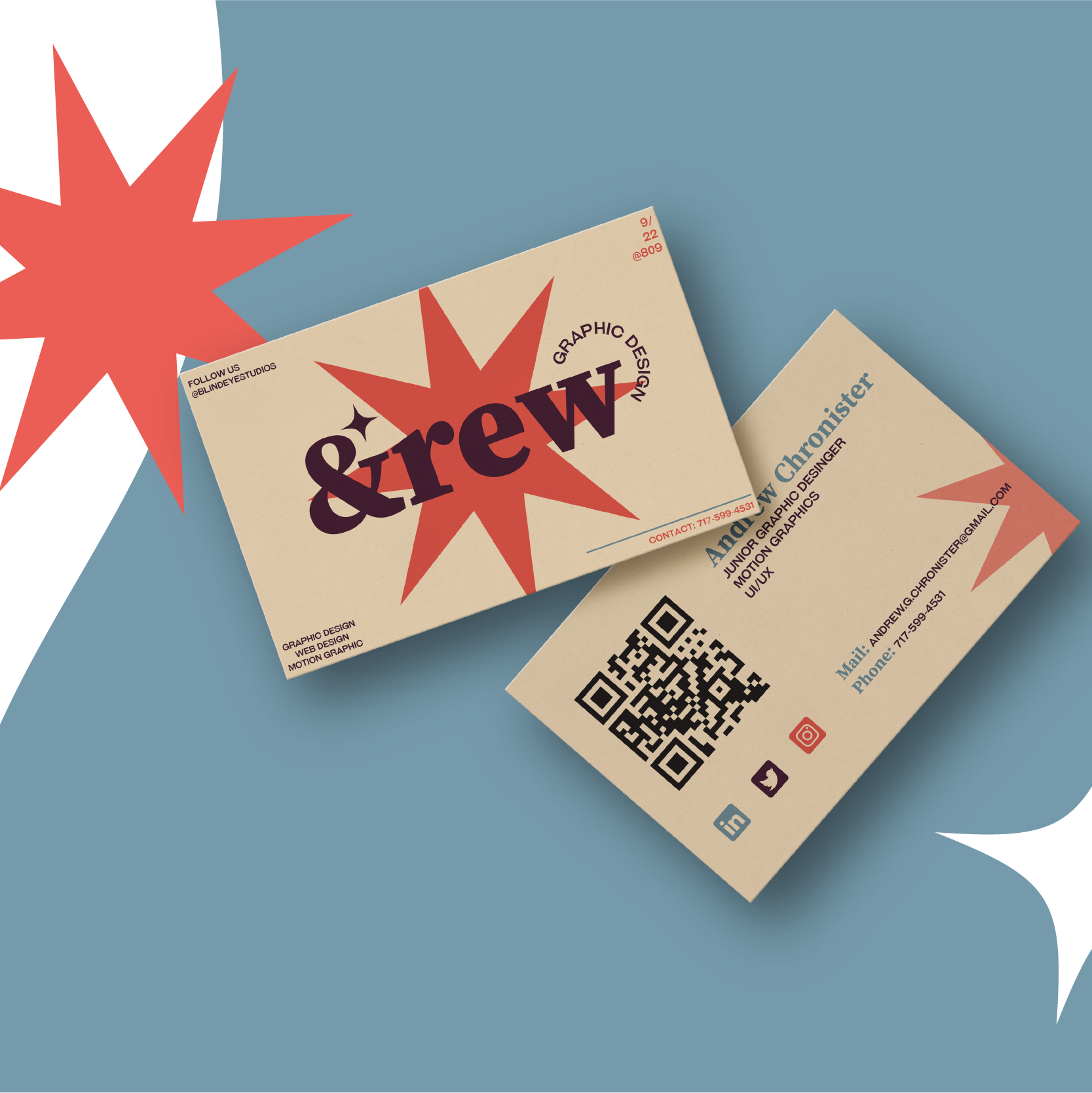
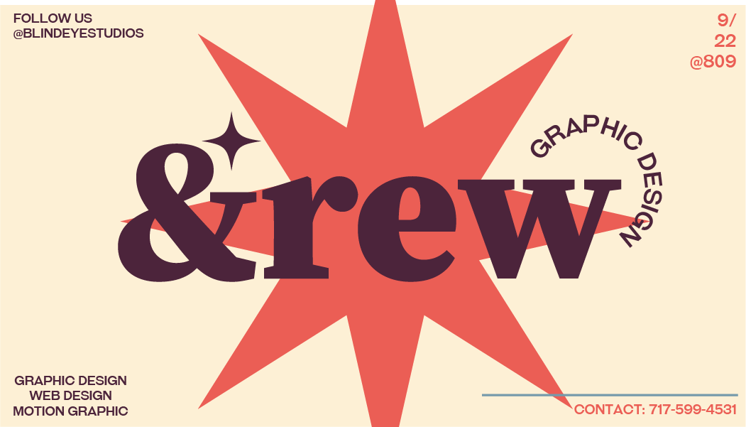
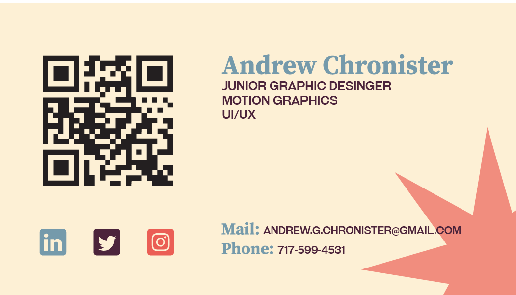
My idea with the business card was to just follow the guideline sheet and incorporate the most important colors. It incorporates the primary logo as well as boilerplate information needed for anyone If I were to hand it to them. The back (hover your mouse over the front) features a QR code that links to all my social media and contact information as well as the on paper information as well.
DESCRIPTION
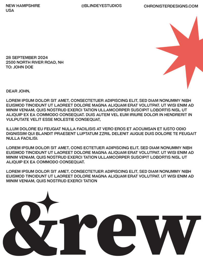
For the letterhead I went with a differnet look with it being on white while still incorporating some brand colors and iconography. The layout itself is readable yet interesting and the logo down at the bottom is large and space filling, linking it to the &rew brand.
MOTION GRAPHIC
I had created this commercial as the first project in my motion graphics course, because I was working simultaneously on the branding project I found it good to tie in the projects. As a result I made a visually pleasing and (for my first attempt) good looking commericial for the brand.